

Conference Material Design


The ask: to create a series of materials for a conference based on an assigned genre. Deliverables would include a map of our chosen venue, a schedule for the event, an event program, and three additional materials.
To get us to experiment with different styles and moods, we were assigned genres at random. I was assigned the "horror" theme. Before I could begin designing, I had to come up with a concept that fit into my genre. I made a concept map to explore the different directions this genre could take me in.

I decided to plan an unsolved murders conference, where participants could learn about some of the most notorious unsolved murder cases in history and develop their investigative skills. My generation is particularly interested in the "true crime" genre, so I figured there would be interest in this kind of conference for those wanting to dive a little deeper into true crime.
Next, I began to plan the details of the event. I found a venue that fit the theme, experts on the topic that could come as speakers, and the four unsolved cases I wanted to focus on. I wrote my ideas down and began to imagine how the conference would flow and what the schedule might look like.

Before working out the designs in InDesign, I made a mood board to express the creative direction I wanted to go in. Rather than defaulting to the conventional red and black color palette typically associated with the "horror" theme, I wanted to make use of more unexpected colors and rely on other design elements to create a "spooky" or "eerie" feeling.

Next, I began to design the event program. First, I planned the layout with some quick sketches.

Once I brought the program into InDesign, I made use of full-page images in black and white, with pops of color to add some visual interest.

As part of our program, we were required to include a map of our chosen venue. I knew that with this kind of map, less is more, so I went for a very simple style, including only the necessary details to help participants navigate the space.

I finished the program in InDesign, including an event schedule, a map, introductions for each speaker, and descriptions of the seminars.


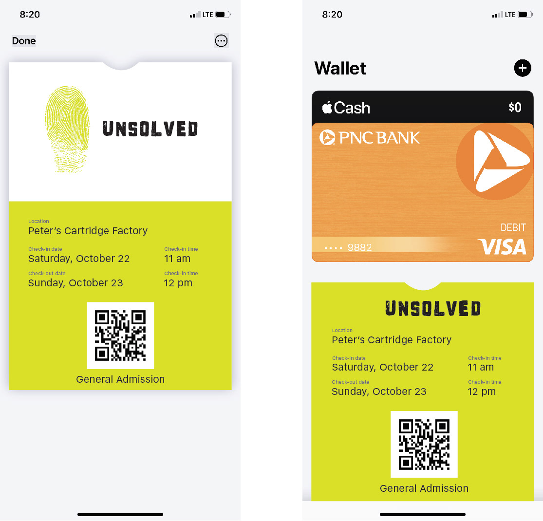
Next, I started working on the three additional materials. My most important factors when deciding which materials were most necessary, were convenience and usability. The majority of event tickets are now digital and can even be added to Apple Wallet, so you reduce the risk of leaving your ticket at home. I decided to make a digital ticket that participants could use to get into the conference. Participants could add the ticket to their Apple Wallet when they register and keep it there until the date of the event.
Once the participant made it into the conference, I wanted them to have an easy way to interact with each other. I decided to make name tags on lanyards. The name tags would also include their Participant ID, so their attendance could be tracked and verified.

For my final material, I wanted to create something that participants could use at the event and beyond. Because each seminar would include so many facts and details, I created a "field notes" journal where participants could write down information from cases and use their notes to "solve" the cases.

This assignment challenged my ability to create a brand that is practical, memorable, and can stretch across multiple mediums. Because I wasn't able to chose my own genre, I was also challenged to explore a style outside of my comfort zone. As a designer, I won't always be working on projects that fit into my "personal aesthetic", so it's important for me to try a variety of different styles.


